1
2
3
4
5
6
7
8
9
10
11
12
13
14
15
16
17
18
19
20
21
22
23
24
25
26
27
28
29
30
31
32
33
34
35
36
37
38
39
40
41
42
43
44
45
46
47
48
49
50
51
52
53
54
55
56
57
58
59
60
61
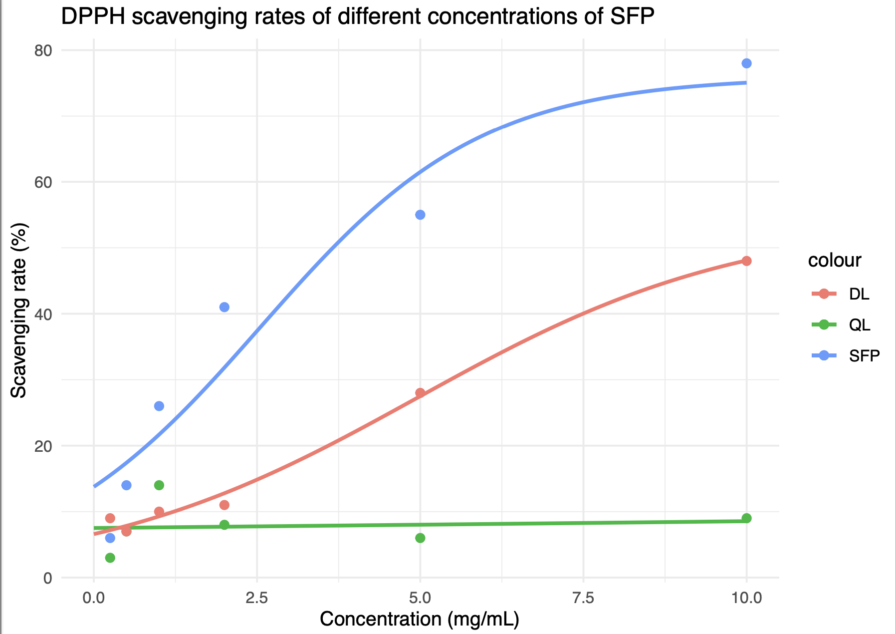
| library(ggplot2)
library(minpack.lm) # 加载minpack.lm包
# 已有的数据和模型拟合,使用nlsLM代替nls
data_SFP <- data.frame(concentration = c(0.25, 0.5, 1, 2, 5, 10),
Clearance = c(6, 14, 26, 41, 55, 78))
model_SFP <- nlsLM(Clearance ~ L / (1 + exp(-k * (concentration - x0))),
data = data_SFP,
start = list(L = 80, k = 1, x0 = 2), # 修改起始值
control = list(maxiter = 200)) # 可能需要增加最大迭代次数
# 第二组数据,使用nlsLM
data_SFP2 <- data.frame(concentration = c(0.25, 0.5, 1, 2, 5, 10),
Clearance = c(3, 7, 14, 8, 6, 9))
model_SFP2 <- nlsLM(Clearance ~ L / (1 + exp(-k * (concentration - x0))),
data = data_SFP2,
start = list(L = 20, k = 1, x0 = 2), # 修改起始值
control = list(maxiter = 200))
# 第三组数据,同样使用nlsLM
data_SFP3 <- data.frame(concentration = c(0.25, 0.5, 1, 2, 5, 10),
Clearance = c(9, 7, 10, 11, 28, 48))
model_SFP3 <- nlsLM(Clearance ~ L / (1 + exp(-k * (concentration - x0))),
data = data_SFP3,
start = list(L = 50, k = 1, x0 = 2),
control = list(maxiter = 200))
# 接下来,创建预测数据框并绘图,此部分与之前的代码相同,只需确保使用正确的模型变量即可
# 注意:此处不再重复绘图代码,你可以使用前面提供的绘图代码进行绘制
# 创建用于绘图的预测数据框
concentration_range <- seq(0, 10, length.out = 100)
Clearance_pred_SFP <- predict(model_SFP, newdata = list(concentration = concentration_range))
data_pred_SFP <- data.frame(concentration = concentration_range, Clearance = Clearance_pred_SFP)
concentration_range2 <- seq(0, 10, length.out = 100)
Clearance_pred_SFP2 <- predict(model_SFP2, newdata = list(concentration = concentration_range2))
data_pred_SFP2 <- data.frame(concentration = concentration_range2, Clearance = Clearance_pred_SFP2)
concentration_range3 <- seq(0, 10, length.out = 100)
Clearance_pred_SFP3 <- predict(model_SFP3, newdata = list(concentration = concentration_range3))
data_pred_SFP3 <- data.frame(concentration = concentration_range3, Clearance = Clearance_pred_SFP3)
p <- ggplot() +
geom_point(data = data_SFP, aes(x = concentration, y = Clearance, color = "SFP"), size = 2) +
geom_line(data = data_pred_SFP, aes(x = concentration, y = Clearance, color = "SFP"), size = 1) +
geom_point(data = data_SFP2, aes(x = concentration, y = Clearance, color = "QL"), size = 2) +
geom_line(data = data_pred_SFP2, aes(x = concentration, y = Clearance, color = "QL"), size = 1) +
geom_point(data = data_SFP3, aes(x = concentration, y = Clearance, color = "DL"), size = 2) +
geom_line(data = data_pred_SFP3, aes(x = concentration, y = Clearance, color = "DL"), size = 1) +
xlab("Concentration (mg/mL)") +
ylab("Scavenging rate (%)") +
ggtitle("DPPH scavenging rates of different concentrations of SFP") +
theme_minimal()
print(p)
|